Case Study: Seaguth Elixirs
Services: Logo Design · Brand Identity · Packaging System
The Challenge
Seaguth Elixirs came to The Visual Factory with a new product and no brand to carry it — no logo, no packaging, no visual identity. In a crowded specialty beverage market, they needed a complete brand and packaging system built from the ground up: something distinctive enough to stand out on a shelf next to established competitors, and premium enough to signal the quality of what was inside.
The Approach
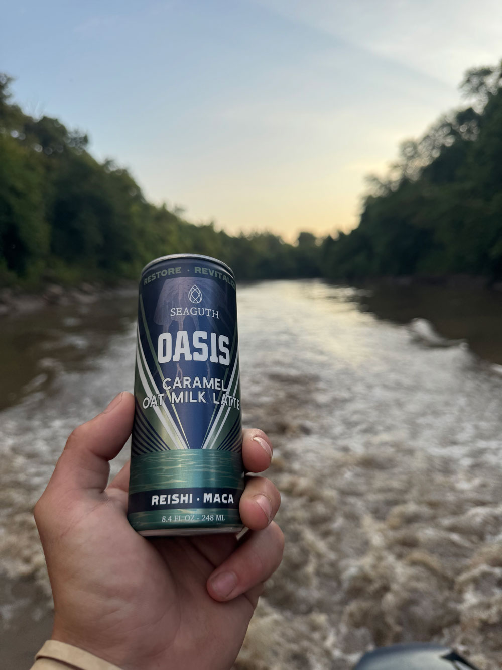
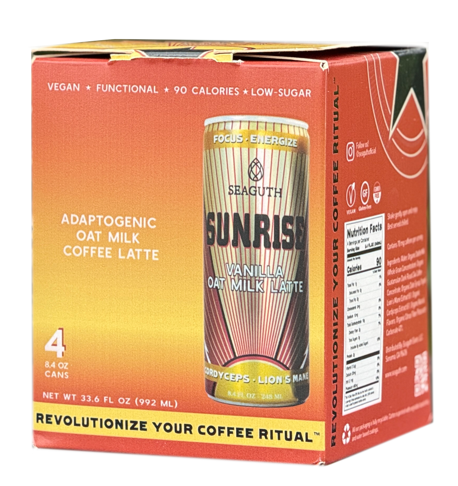
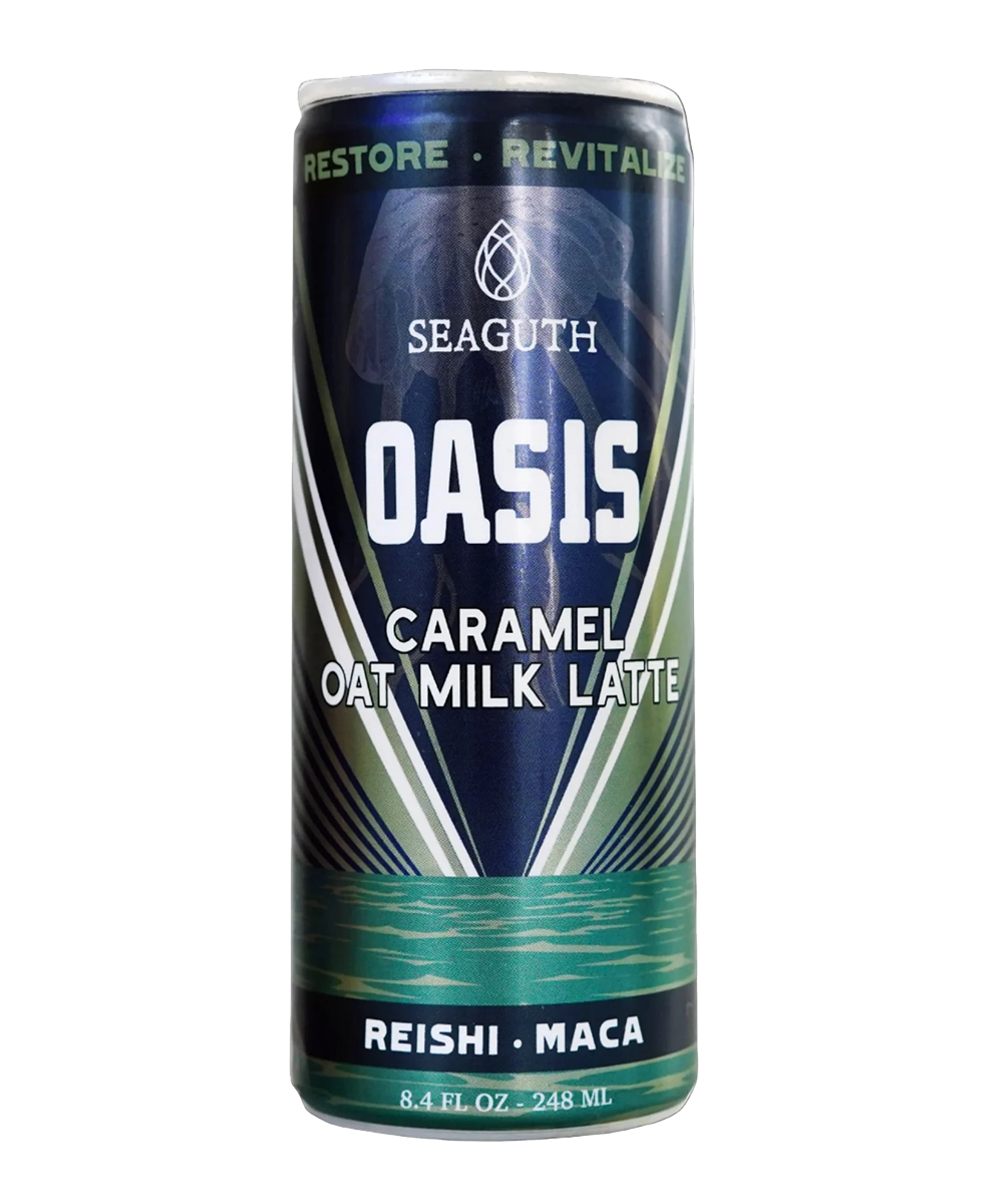
We built Seaguth's identity from scratch, starting with a logo designed to feel both craft and elevated — a mark that could carry the brand across every touchpoint that followed. From there, we developed a full packaging system, including can design and label work, ensuring the brand felt cohesive and intentional whether it was sitting on a retail shelf or in a customer's hand.
Every design decision was made with shelf presence and brand recognition in mind — the goal wasn't just a good-looking package, but one that could do real work: turning heads, building trust at first glance, and giving Seaguth a foundation to grow from.
The Results
The new identity and packaging helped launch Seaguth from the ground up — and the results spoke for themselves:
- Named a finalist for Best Product in the World Coffee Innovation Awards (2025)
- Grew from 0 to 30 retail stores in just 6 months
- Featured product in the artist hospitality area at the Monterey Jazz Festival
- Press coverage in Marin Edible Magazine and multiple beverage/lifestyle blogs
From a blank slate to an award-recognized, retail-ready brand — Seaguth Elixirs is a case study in what a strong identity and packaging system can do for a new product entering a competitive market.
Featured In
- North Bay Bohemian — "Potion Notion: Seaguth Elixirs' Geoff Broll"
- Pacific Sun — "Potion Notion: Seaguth Elixirs' Geoff Broll"
- Seaguth Elixirs Press & News — seaguth.com/blogs/seaguth-news